We are thrilled to announce the release of a feature-rich update for our Dashboard. This update brings exciting new features that provide valuable insights and enhance the user experience. Let’s explore the key features included in this release:
Key Features and Enhancements
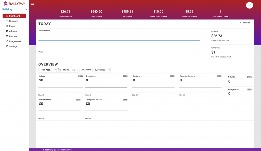
Header:
When accessing a Cause, you will now see a top header that displays important data specific to that Cause. The following information will be available:
- Available Balance
- Gross Volume
- Net Volume
- Shared Gross Volume (Gross amount received from brokers)
- Shared Net Volume (Net amount received from brokers)
- Total Shared Clients (Total number of brokers attached to the cause)
Time Zone:
We understand the importance of accurate time representation. Therefore, we have introduced four time zones for viewing dashboard data: Central Standard Time, Pacific Standard Time, Mountain Standard Time, and Eastern Standard Time. If your time zone is not among these four, the dashboard data will be displayed in Pacific Standard Time by default. Additionally, the time zone will be visible in the top-right corner of the dashboard. The dashboard data will align with the time zone set on your machine.
Today:
The “Today” block provides valuable information for the current day, including:
- Gross Volume (transactions): Displays the total amount of donations made on the current day, represented through a line graph.
- Available to withdraw balance: This shows the balance available for withdrawal.
- Withdrawal deposited yesterday: This represents the amount deposited from the last successful withdrawal made for the cause.
Overview:
The “Overview” section allows you to compare data between two selected date ranges. This feature enables you to calculate the percentage increase or decrease in performance. After selecting the dates, the following eight parameters will be displayed, providing comprehensive data for the cause:
- Volume: Represents the total amount of donations made within the selected date range. A line graph is also available for visual representation. The “Compared to” dropdown allows you to compare the current data with a previous date range, calculating the percentage increase or decrease.
- Transactions: This shows the total number of donations made within the selected date range. Similar to the Volume parameter, a line graph is available, and the “Compared to” dropdown enables percentage comparison.
- Contacts: Displays the count of unique credit card details associated with the cause within the selected date range. Line graphs are available to visualize contact data, and the “Compared to” dropdown allows for percentage comparison.
- Recurring Contacts: Represents the number of recurring donations made with unique credit card details within the selected date range. Line graphs provide a visual representation, and the “Compared to” dropdown facilitates percentage comparison.
- Refunds: Shows the total number of refunds issued within the selected date range. You can view a line graph and use the “Compared to” dropdown to calculate the percentage change.
- Chargebacks: Displays the total number of chargebacks within the selected date range. Similar to other parameters, a line graph is available, and the “Compared to” dropdown allows for percentage comparison.
- Refund Amount: This represents the total amount refunded within the selected date range. Line graphs provide a visual representation, and the “Compared to” dropdown facilitates percentage comparison.
- Chargeback Amount: Displays the total amount associated with chargebacks within the selected date range. Line graphs provide a visual representation, and the “Compared to” dropdown allows for percentage comparison.
These enhancements to the Dashboard provide users with valuable insights into the performance of their causes, facilitating data-driven decision-making and a better understanding of key metrics.
We are confident that these new features will greatly enhance your experience with our platform. We encourage you to explore the updated Dashboard and take advantage of the valuable insights it provides.
Thank you for your continued support and valuable feedback. We remain committed to delivering exceptional experiences and continuously improving our platform.
Best regards,
Derek Belfield
Chief Operating Officer, RallyPay
